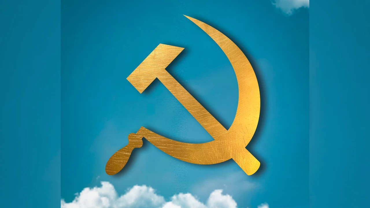
In an unexpected move, the CPIM’s official social media pages underwent a sudden and striking change on Sunday, igniting sharp reactions across the internet. The party's iconic red display picture was replaced with one featuring a blue sky, wisps of white clouds, and a glowing golden hammer and sickle. The colour scheme—blue and white—immediately caught the eye of netizens, many of whom quickly drew comparisons to the political style and colour branding of Chief Minister Mamata Banerjee.
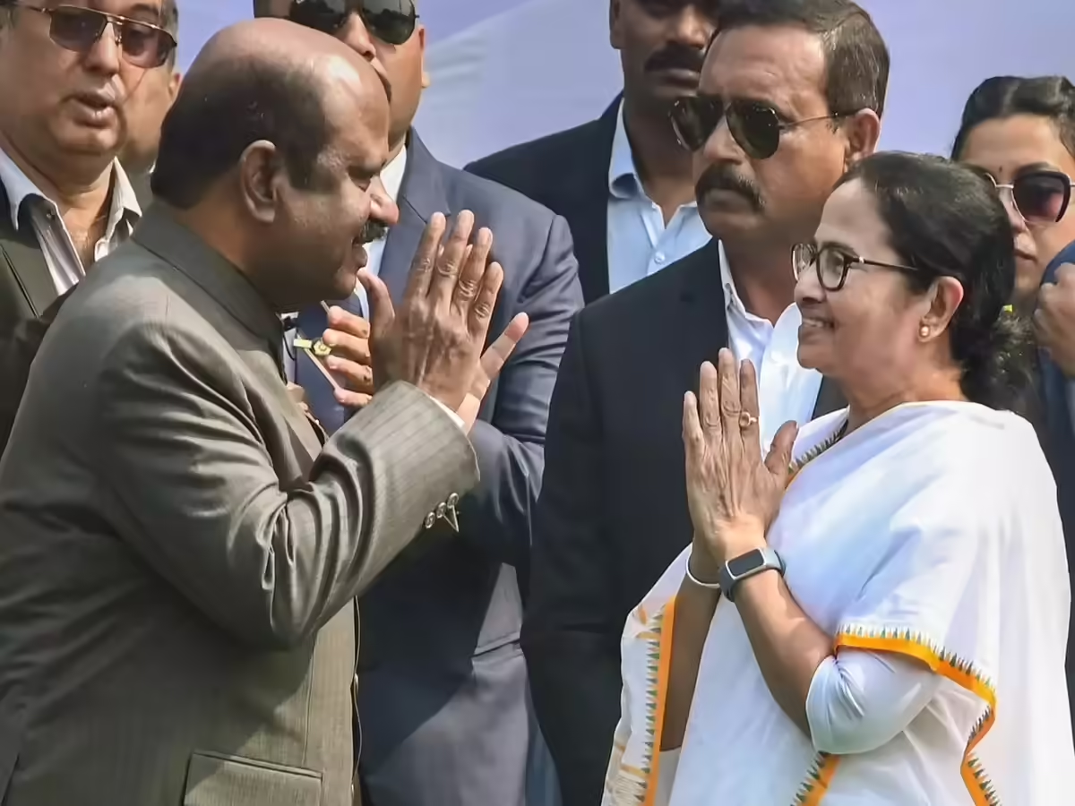
The new colour scheme is closely associated with Mamata Banerjee’s tenure since she came to power in 2011. After overthrowing the Left's 34-year rule, the Chief Minister adopted blue and white as the colours of her administration. The Writers’ Building, once the seat of Left power, was marked by the colour red. In stark contrast, the new state secretariat, ‘Nabanna’, where Mamata Banerjee now sits, is painted in blue and white. The same colour theme is used for state branding all across- from Business summit to even film festival in Kolkata.
This change comes months ahead of the 2026 assembly elections and adds another layer of complexity to CPIM's uphill battle. The party, which has been on a steady decline since 2011, has seen its vote share drastically reduced. In the 2021 state assembly elections, CPIM's vote share plummeted to less than 5%, with the party failing to secure a single seat despite an alliance with Congress. The party’s vote share marginally increased in the 2023 panchayat elections, but in the 2024 Lok Sabha polls, CPIM saw another dip, securing only 5.7%, compared to 6.33% in 2019.
While CPIM leadership has yet to comment on the reason behind the sudden change, sources within the party suggest that the shift is aimed at changing public perception. "There are certain things we can't make public. The declining vote share indicates a reduced acceptance of our party. We believe the colour red has negative connotations for many and is linked to an outdated identity. By adopting a fresher approach, we aim to signal that we are not the same party burdened by past baggage and are asking for a second chance," said a senior CPIM leader, speaking anonymously.
The shift also reflects a broader internal change within the party. In the 2024 Lok Sabha elections, CPIM introduced younger candidates, signalling an attempt to rejuvenate the party by giving the next generation a chance to lead. However, the senior leadership’s dominance—especially among those well past retirement age—has often been criticised for hindering the party's revitalisation.
Despite these internal changes, the new colour scheme has sparked a flood of social media reactions, particularly on Facebook. Many users mocked the move, with one commenter, Soumik Das, humorously writing, “Firbe na aar se firbe na” ("They won’t return"), which quickly went viral. Others suggested the shift to blue and white represented a political surrender to Mamata Banerjee’s successful color strategy, with critics accusing the Left of failing to come up with anything fresh.
The backlash highlights a growing public perception that CPIM is scrambling to align itself with the political landscape defined by Mamata Banerjee, even if it means borrowing from her visual identity. As the CPIM prepares for the upcoming election cycle, the party will need to reckon with not just its changing colours, but its ability to redefine itself in the eyes of a public that has increasingly embraced Mamata's leadership over the past decade.